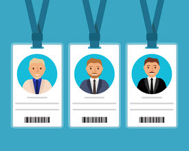
Have you ever walked into someone's office and seen an event badge collection hanging on their wall? If not, know that lots of people save their event badges as a memory. So if you think that carefully designing a badge isn’t worth your time, think again.
A quality badge design equals professionalism and a positive attendee experience. Apart from that, you can take good advantage of stunning visuals and strengthen the position of your brand, company, or event as something that cares about its identity.
An efficient badge design can even increase your attendees’ confidence in approaching other people at your event and starting a conversation. That’s why, although it’s much easier, using a default template for your badge design might not be a good idea. To make an impact and better serve your attendees’ intentions (of being recognized or of easily recognizing potential prospects, for example), you need to come up with something authentic and well-structured.
This is a task you could share with a visual designer. You can make a selection of badges you like and, taking the brand elements of your event or company into consideration, you can ask the designer to work on a few propositions. To help with this task, we’ve put together a list of recommendations on how to create dynamic attendee badges:
Tip 1. Avoid certain color combinations
The most important thing about designing a customized badge for your attendees is the possibility to personalize it with your brand colors and images. However, don’t rush into filling out every single blank space, and be aware of the color combinations you choose.
For example, avoid going for military green as the background of the badge if the text is yellow, or bright color combinations. It’s a matter of aesthetics, but it also impairs the visibility of the text.
If you aren’t sure if you chose a good color combination, just print it and ask around. See what others think. If you still aren’t sure, go for a safer design: a white background and minimal icons, plus the text.
Tip 2. Keep the badges error-free
OK, this has nothing to do with the badge design, yet it plays a crucial role in how your attendees will perceive the overall look. No one likes to see their name misspelled.
It doesn’t matter how beautiful or stylish the badge is—if the name of your guest is wrong, you’ll spoil their experience, and perhaps, their mood for the entire event. That’s why it’s important to keep the badges error-free.
You can accomplish that by automatising the registration process with the badge generation. This means that however your attendee wrote his or her name on the form is how it will appear on the badge.
Short of a typo, most people won’t misspell their own name. Just in case, always have blank badges available during the check-in procedure. If someone notices their name or company name is misspelled, you can offer to generate another badge quickly.
Tip 3. Don’t overload the badge with too much information
Keep attendees’ badges as simple as possible. Resist the urge to fill up the whole badge with information. You can limit the badge to their name and company name, or their name and home country (if applicable).
Or you could include the attendees’ names and companies, plus a small icon that signifies their origin countries, such as their home country’s flag.
Try to keep the information minimal. There’s no need to mention attendees’ roles or hobbies, or what languages they speak. Remember, the event badge is just an identifier. You can store attendees’ bio information on the event mobile app for others to read.
Tip 4. Adapt the badges according to the attendee segmentation
Usually, your event will have different types of attendees. Depending on the dynamics you’ll be running, you can have VIPs, premium attendees, speakers’ visitors (if you’re running an exhibition), staff members, etc. You could even go one step further and create a template for each attendee group.
Tip 5. Make sure the entire badge structure is user-friendly
As author Kevin Van der Straeten indicates, “Not everyone is happy to ‘spoil’ their nice new outfit by pinning a badge to it. In some cases, the pin might even cause damage to fine fabrics. In other cases, a too-noticeable badge can ruin their elegant festive look altogether.”
No matter how nice the attendee badge is, if wearing it means your event guests will damage their clothing, the experience won’t be the same. That’s why, “you should consider the various alternatives, such as lanyards, textile stickers, magnetic badges and wristbands.”
Final thoughts
One last thing to remember: Make sure the event badge has an attractive design. This will increase the attendees’ desire to keep it as a token, which will help them remember your event. Try to keep the design simple, avoid weird color combinations, make sure there are no typos or misspelled names, and provide a friendly badge structure that won’t damage your attendees’ clothing.


