When we hear the term 'visual appeal', we tend to think about attractive websites, interesting product designs, or high-quality photos and graphics. We might also imagine a cozy room or office that is visually balanced and nice-looking.
But we never think about an event in terms of its visual appeal, which is a shame, since events can also have their own particular (visual) style and produce different emotions. From the graphics and signage to the venue design and lighting, there are multiple elements that can be integrated into an event’s visual identity.
Why is this important?
Well, think about it: 90% of the information transmittedthrough the brain is visual. The entire “feeling” of an event is conditioned by the reaction your attendees have to the visual stimulus the environment provides.
In other words, if your event is not visually appealing, you run the risk of decreasing its impact or authority. Apart from that, there’s a thin line between your guests’ visual experiences and your event’s marketing potential.
What’s that?
Instagram. How many 'ugly' events have you seen on there? Chances are not too many, because people tend to take and post attractive photos. Obviously, you shouldn’t plan your event thinking about “Instagram-worthy” opportunities.
However, you should always think about providing both a visually pleasant environment and experience. Here’s how you can do it:
Recommendation 1. Define the event brand itself
Think about your event from a brand strategy perspective. How do you want to position your event? What are your business needs and expectations, and how can the event help you accomplish them? What context and feelings do you want attendees to experience at your event? What’s the core essence of your event?
These questions will help you understand the brand you want to present to the world. Subsequently, this will also give you the necessary framework to come up with all the elements (design and visuals included) that will help you set up your brand, envision your strategy, and determine the actions you must take.
Recommendation 2. Create stylescapes for your event
As Chris Do, famous designer and entrepreneur, explains, a stylescape is a design deliverable that helps present the visual language direction of a project. They can consist of fonts, colors, logos, forms, images, interfaces, or physical elements. Y
our event’s stylescapes may translate into graphics, print collaterals, photos, videos, or packaging, as well as patterns, materials, textures, etc. In other words, once you’ve figured out your brand strategy, the next step is to create a style book detailing the elements that will transform into reality your vision.
{"video":"https:\/\/www.youtube.com\/embed\/lGmPCutgI2o"}
For example, you can decide to go with a specific color of the venue and bring in a specific type of furniture to match that color, or choose a specific pattern for the video wall. The important thing to remember is that it takes more to make a space visually appealing than just adding a few things you think are 'pretty'.
There is an entire method behind that requires thought and time to align all these design elements with your brand strategy and business goals. In other words, stylescapes help you picture the space as you want it and take the necessary action to achieve the desired effects.
Recommendation 3. Place “Instagrammable” and selfie spots throughout the venue
Now, to continue with the actions that will help you transform your event into a visually appealing setting, let’s tackle what it means to make your event 'Instagrammable'. People usually take pictures with things or places that are eye-catching and worth sharing. In other words, anything that is “visually appealing,” whether it’s a cookie or a historic landmark, will end up on Instagram sooner or later.
Consider setting up a beautiful design for the lighting or some unusual art installations. And don’t forget about adding some “selfie spots” throughout the venue, with different colorful backgrounds or decorations.
Recommendation 4. Ensure white and 'clean' venue spaces
It seems that wherever we go these days, we’re bombarded with information and advertising. As author Matthew Crawford writes in his book The World Beyond Your Head: On Becoming an Individual in the Age of Distraction, just take a look at airport hallways. If you want to escape data and publicity overload, you must pay a fee and go to a business lounge.
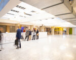
Spaces that carry too much information can be a bit overwhelming, because the brain's natural response is to absorb everything in proximity. To give your attendees a more pleasant visual experience, think about setting up a few areas or lounges throughout the event venue that won’t overstimulate the senses. These spaces will help your guests focus better, relax, and engage in more meaningful interactions.
Wrap-up
Transforming your event venue into a visually appealing space is not a passing fad. If you want to make your attendees’ overall experience truly pleasant, you’ll have to rethink the way you present the space and actively involve yourself in the process of designing the environment.


